Partial regression and partial residual plots

FW8051 Statistics for Ecologists

Learning Objective

Understand approaches for visualizing fitted multiple regression models

Visualizing Simple Linear Regression

ggplot(LionNoses, aes(proportion.black, age)) + geom_point() + 
  geom_smooth(method = "lm") +
  theme_bw()
Scatterplot of ages versus proportion of a lion's nose that is black with regression line overlayed.

Multiple regression

data(clutch, package = "Data4Ecologists")
ggplot(clutch.r, aes(date, clutch, color = year)) + geom_point() +
  theme_bw()
Scatterplot of clutch size versus nest initiation date with color to show observations for the different years.

Multiple regression

lm.fit1 <- lm(clutch ~ year + date, data = clutch.r)
summary(lm.fit1)

Call:
lm(formula = clutch ~ year + date, data = clutch.r)

Residuals:
    Min      1Q  Median      3Q     Max 
-3.2815 -0.6219 -0.2235  0.6514  3.9304 

Coefficients:
             Estimate Std. Error t value Pr(>|t|)    
(Intercept) 15.852483   0.757991  20.914  < 2e-16 ***
year1998    -0.344801   0.287552  -1.199    0.233    
year1999    -0.125952   0.274168  -0.459    0.647    
date        -0.041478   0.005904  -7.026 1.07e-10 ***
---
Signif. codes:  0 '***' 0.001 '**' 0.01 '*' 0.05 '.' 0.1 ' ' 1

Residual standard error: 1.288 on 130 degrees of freedom
Multiple R-squared:  0.2789,    Adjusted R-squared:  0.2623 
F-statistic: 16.76 on 3 and 130 DF,  p-value: 2.889e-09

Visualizing Multiple Regression

\[Clutch_i \sim N(\mu_i, \sigma^2)\] \[\mu_i = \beta_0+\beta_1I(Year = 1998)_i + \beta_2I(year = 1999)_i + \beta_3date_i\]

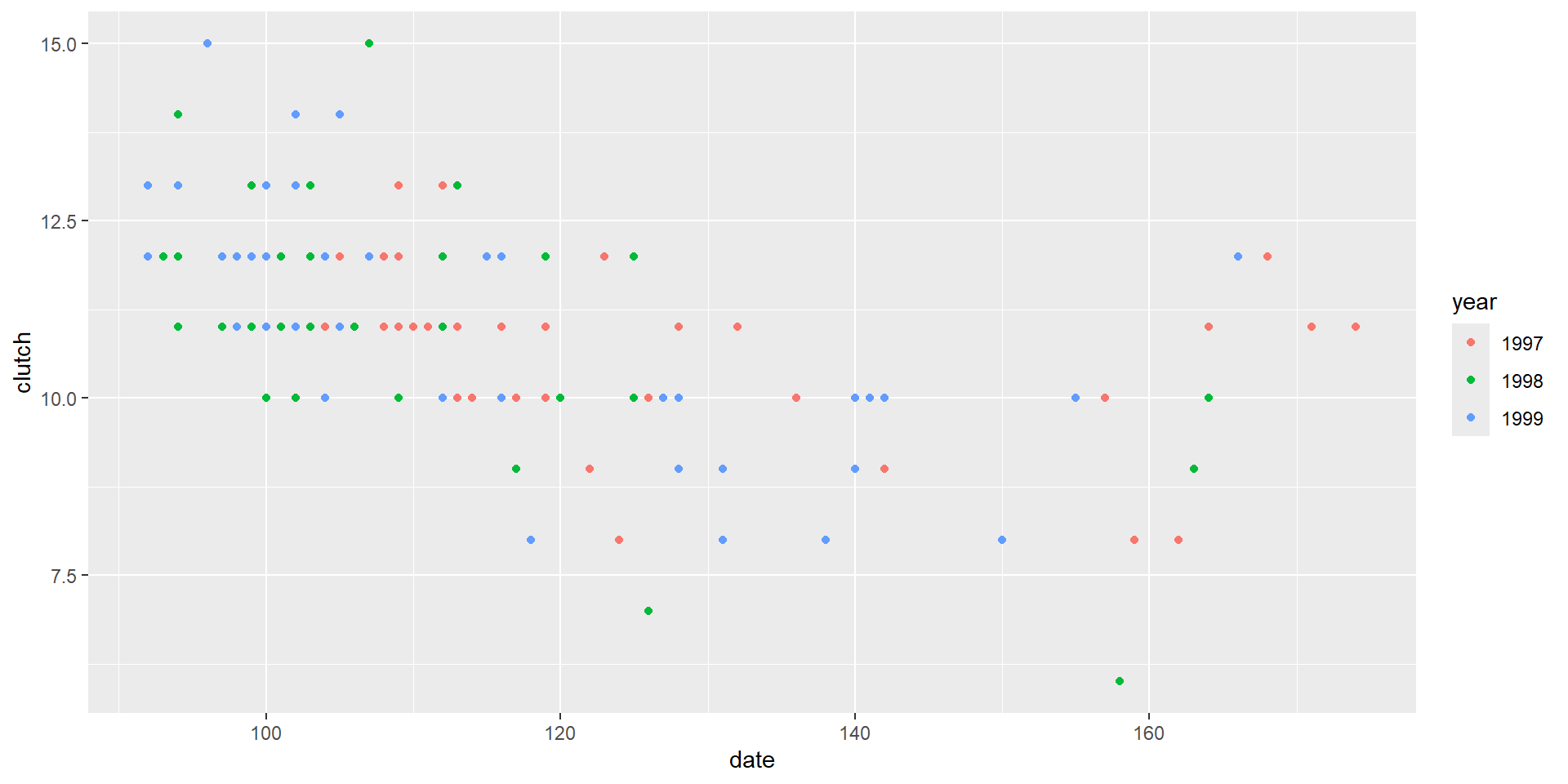
\(\beta_3\) reflects the “effect” of nest initiation date after accounting for year.

How can we visualize this “effect”?

  • Added variable or partial plots
  • Component + residual or partial plots

See the paper by Larano and Corcobado (2008) and Section 3.14 in the Book.

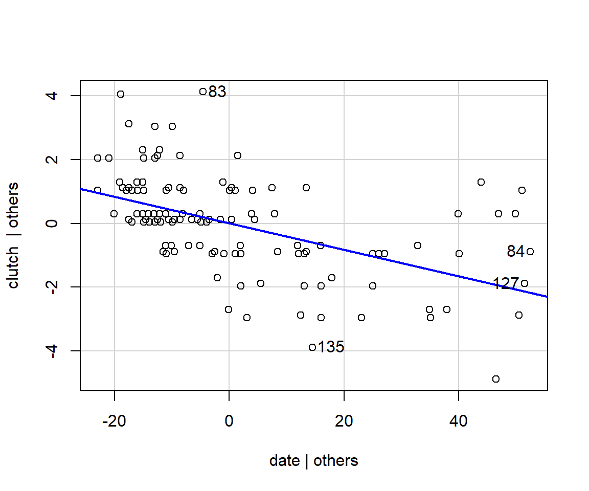
Added Variable Plots (for \(X_i\))

  1. Regress \(Y\) against \(X_{-i}\) (i.e., all predictors except \(X_i\)), and obtain the residuals
  1. Regressing \(X_i\) against all other predictors (\(X_{-i}\)) and obtain the residuals
  1. Plot the residuals from [1] against the residuals from [2].

Plots the part of \(Y\) not explained by other predictors (i.e., \(X_{-i}\)) against the part of \(X_i\) not explained by the other predictors (\(X_{-i}\)).

Lets us visualize the effect of \(X_i\) after accounting for all other predictors.

car::avPlots(lm.fit1, terms = "date")
Partial regression plot for date.
  • Shows the slope and the true scatter of points around the partial line in an analogous way to bi-variate plots in simple linear regression
  • Tells us about the importance of \(X_2\) (given everything else already in the model)
  • Can help with diagnosing non-linearities
  • Helps visualize influential points and outliers

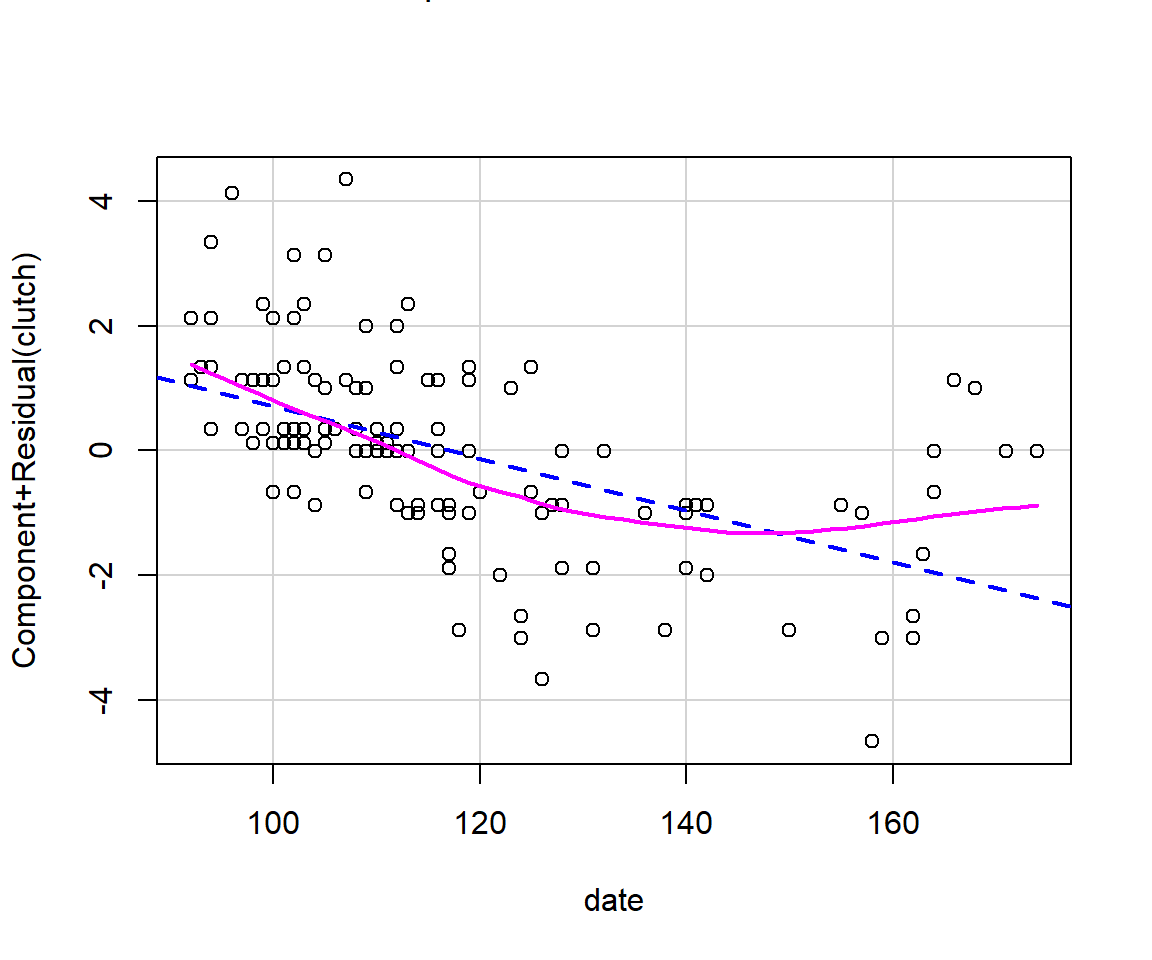
Component + residual plots or partial residual plot

Plots \(X_i\beta_i + \hat{\epsilon}_i\) versus \(X_i\).

  • Better for diagnosing non-linearities
  • X-axis depicts the scale of the focal variable (rather than the scale residuals)
  • Not as good at depicting the amount of variability explained by the predictor (given everything else in the model).
  • Easy to generalize to regression models with polynomials/splines and other types of regression models

Component + residual plot

car::crPlots(lm.fit1, terms = "date")

Effect plots: Adjusted Means

\[Clutch_i \sim N(\mu_i, \sigma^2)\] \[\mu_i = \beta_0+\beta_1I(Year = 1998)_i + \beta_2I(year = 1999)_i + \beta_3date_i\]


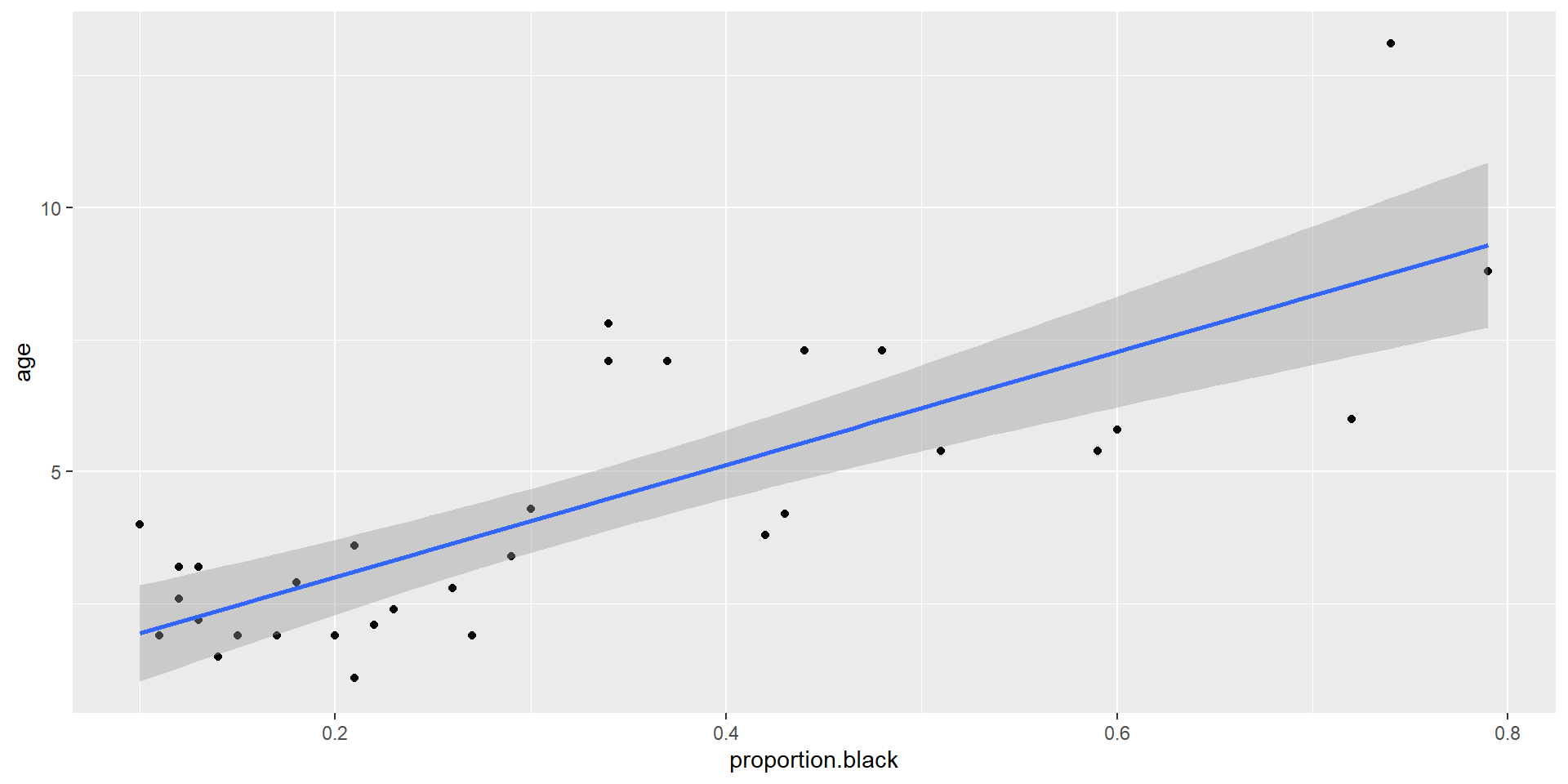
We can plot adjusted means by varying a focal variable over its range of observed values, while holding all non-focal variables at constant values (e.g., at their means or modal values).


Depict \(\hat{\mu} |\) Year = 1998, Date = date for a range of date values.

Effect plots: Marginal Means

\[Clutch_i \sim N(\mu_i, \sigma^2)\] \[\mu_i = \beta_0+\beta_1I(Year = 1998)_i + \beta_2I(year = 1999)_i + \beta_3date_i\]

Alternatively, we can plot marginal means.

Calculate \(\hat{\mu}_i |\) Year = \(year_i\), Date = date for the observed Year values in the data set (and a range of date values).


Plot \(\bar{\hat{\mu}}_i |\) Date = date versus date.


We will spend more time exploring these options when using generalized linear models